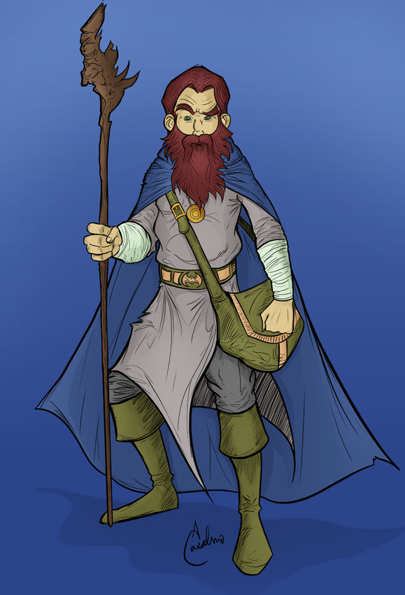
I decided to finish the colors to Algerbane’s new look:
Signup for My Newsletter
Reader Interactions
Comments
NateBBQsays
I kinda like the flats, without the additional shading. Kind of a different feel, kinda old school like the comics and 80’s cartoons in my memories (i’m only 30, but I read a lot of comics when I was little). Just curious what a flat version of the page would look like?
@Nate, well all the comics start out like that. I tend to add additional highlights because I feel the artwork needs the extra depth. I’ve been debating trying a few with simple flat colors.
NateBBQsays
Definetly should! You could flat the characters and do highlights to the scenery.
@Nate, hmm, that’s def an option. The trick is to have line art that is strong enough on its own, without colors. That’s always been my goal.
NateBBQsays
The art on the “new” Algerbane is definetly strong in my opinion (though I’m not an artist, I know what I like). I can see the detail of the lines better in the flat version than with the addition of highlights. Have you thought about doing a heavier line? I use PvP, by Scott Kurtz, as reference, especially the last two or three years worth. Heavy(ish) lines with good colors. I realize the styles are different with the level of detail, but I dunno, I don’t feel like I’m missing detail with his stuff. Nor your’s either!

I kinda like the flats, without the additional shading. Kind of a different feel, kinda old school like the comics and 80’s cartoons in my memories (i’m only 30, but I read a lot of comics when I was little). Just curious what a flat version of the page would look like?
@Nate, well all the comics start out like that. I tend to add additional highlights because I feel the artwork needs the extra depth. I’ve been debating trying a few with simple flat colors.
Definetly should! You could flat the characters and do highlights to the scenery.
@Nate, hmm, that’s def an option. The trick is to have line art that is strong enough on its own, without colors. That’s always been my goal.
The art on the “new” Algerbane is definetly strong in my opinion (though I’m not an artist, I know what I like). I can see the detail of the lines better in the flat version than with the addition of highlights. Have you thought about doing a heavier line? I use PvP, by Scott Kurtz, as reference, especially the last two or three years worth. Heavy(ish) lines with good colors. I realize the styles are different with the level of detail, but I dunno, I don’t feel like I’m missing detail with his stuff. Nor your’s either!